SEAGROCER
Southeast Asian cuisine is celebrated for its bold flavours, rich spices, and the harmony of multiple ingredients coming together in every dish. For many expats, food is more than just sustenance—it’s a comforting taste of home. A familiar meal can be the quickest way to ease homesickness, bringing warmth and nostalgia with every bite. However, for Southeast Asian expats in Singapore who love to cook, recreating these beloved dishes can be a challenge. Sourcing the right ingredients often means visiting multiple stores, making the process time-consuming and inconvenient. To solve this, I am designing an e-commerce website that simplifies ingredient shopping, making authentic home-cooked meals more accessible and hassle-free.
Overview
Role :
Website Design
Timeline :
2 weeks
Tools :
Figma, Kardsort, Proven by Users
Location :
Singapore
TL;DR

GOT MORE TIME?
Read the details process below
Overview
Recruiting & Interviews
Persona 1
Persona 2
Problem Statement
Recruiting & Interviews
After a couple of user interviews of various foreigners in Singapore, I have narrowed down my persona to target single, living alone expats that are residing in Singapore.
The similarities that I found in this user group are:
They like to cook their local dish
They prefer using authentic ingredients
They have or often shop groceries online
Persona 1
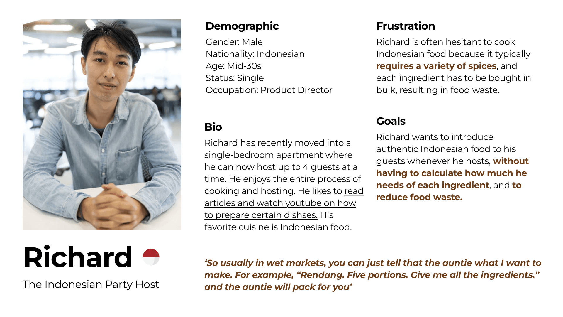
Richard is an Indonesian professional in his mid-30s who has recently moved into a single-bedroom apartment, allowing him to host small gatherings. Passionate about both cooking and entertaining, he enjoys preparing Indonesian cuisine for his guests. To refine his skills, he frequently reads articles and watches videos on how to cook traditional dishes.
Despite his enthusiasm, Richard is often hesitant to cook Indonesian food because it requires a variety of spices and ingredients, most of which need to be purchased in bulk. This not only leads to unnecessary food waste but also makes the preparation process more complex.
He shared, ‘So usually in wet markets, you can just tell that the auntie what I want to make. For example, “Rendang. Five portions. Give me all the ingredients.” and the auntie will pack for you’
Richard’s ideal solution would allow him to prepare authentic Indonesian dishes without the hassle of manually calculating ingredient quantities. He wants a more intuitive way to buy just the right portions needed for his recipes, reducing both effort and waste while making it easier to share his love for Indonesian cuisine with friends.
Persona 2

Jasmine is a Thai professional in her late 20s who has been living in Singapore for six years. Due to her company’s work-from-office policy, she rarely visits Thailand and often finds herself missing the taste of home. She enjoys cooking simple Thai meals but frequently struggles to find the right spices and sauces locally. To bridge this gap, she searches for authentic recipes from Thai chefs online.
One of Jasmine’s main frustrations is the lack of availability of Thai cooking ingredients in Singapore. To compensate, she buys them in bulk whenever she visits Thailand and brings them back. However, when she runs out, she is often forced to choose different brands, which sometimes affects the authenticity of her dishes.
Her goal is to have easier access to Thai spices and sauces in Singapore’s grocery stores or through an online platform, allowing her to cook her favorite meals without compromise. A solution tailored to Jasmine would prioritize convenience, authenticity, and ensuring she gets just the right amount of ingredients when she needs them.
Problem Statement
Richard and Jasmine, who find recipe inspiration online, need locally available ingredients in precise, tailored portions to cook authentic dishes that bring them a taste of home while avoiding food waste.
Overview
Competitor Comparison
Card Sorting
Tree Testing
Competitor Comparison
To understand existing solutions, I analyzed the top five eCommerce grocery stores in Singapore. I found that they all followed a conventional item-based format, requiring users to manually select each ingredient. While functional, this approach lacked the flexibility to recommend ingredient quantities based on recipe portions, making it less intuitive for users who wanted to cook specific dishes without food waste.
Card Sorting
To ensure that the website’s navigation aligned with user expectations, I conducted a card sorting exercise. This method allowed me to understand how users naturally categorize ingredients, recipes, and purchasing options. By analyzing patterns in how participants grouped different items, I was able to create a more user-friendly structure that made it easier for them to find what they needed quickly.

Tree Testing
Following card sorting, I conducted tree testing to validate the effectiveness of the website’s navigation and labeling. This helped me determine whether users could easily locate specific ingredients and recipe-related categories. By testing how well users could complete common tasks, I refined the hierarchy and naming conventions to ensure an intuitive browsing experience.
03 Design
Overview
Dishes-approach
Recipes Recommendation
Recipes Recommendation
Dishes-approach

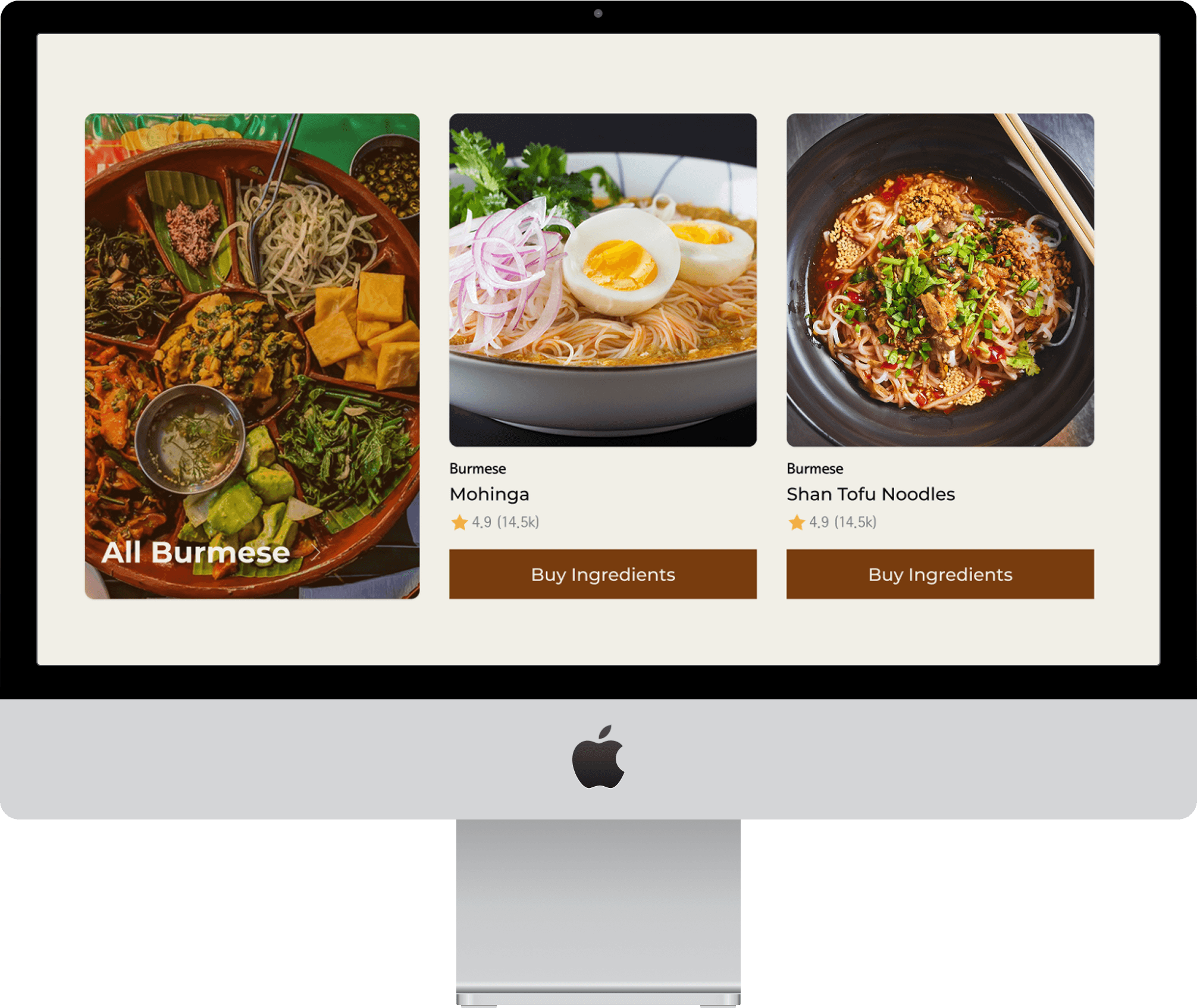
Instead of presenting users with an overwhelming list of products, the homepage prompts them with a simple question: What are you craving? This shifts the experience from a transactional shopping process to a more intuitive and engaging journey, where users can explore dishes first before thinking about ingredients. By prioritizing meals over grocery items, the platform aligns more closely with how people decide what to cook.
Recipes Recommendation
To further assist users in meal preparation, I introduced dedicated recipe pages categorized by cuisine. These pages provide curated recipe recommendations, making it easier for users to discover new dishes and learn how to cook them. By integrating recipes directly into the shopping experience, users no longer have to search elsewhere for guidance—they can seamlessly move from inspiration to ingredient selection in one place.
Checkout per portion
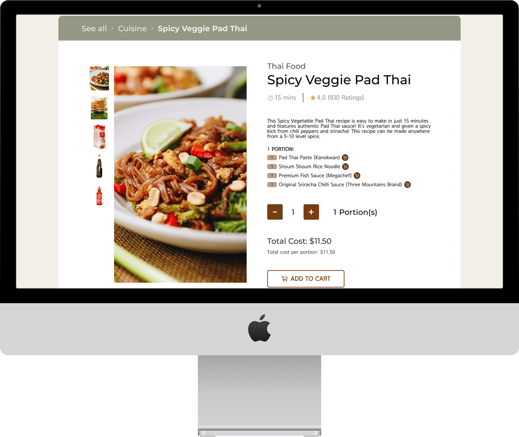
A key innovation in the checkout process is the ability to purchase ingredients based on the number of portions users want to prepare. Instead of manually selecting ingredient quantities, users simply enter how many servings they need, and the system automatically calculates and adds the required ingredients to their cart. This eliminates the guesswork, minimizes food waste, and ensures a more streamlined shopping experience.
04 Testing
Overview
Task 1: Shop ingredients to make Spicy Veggie Pad Thai
Task 2: Shop for a pack of Pad Thai Paste from Spicy Veggie Pad Thai page
Room for Improvements
Task 1: Shop ingredients to make Spicy Veggie Pad Thai
During user testing, participants were given the task of shopping for ingredients to make Spicy Veggie Pad Thai. The results showed a 100% success rate, with all users able to complete the task seamlessly. Notably, every participant immediately navigated to the “Find Recipes” button in the homepage hero section, indicating that the dishes-first approach effectively guided them in the right direction without confusion.
On average, users completed the task within one minute, demonstrating an efficient and intuitive browsing experience. The streamlined navigation and clear call-to-action contributed to the quick completion time, reducing cognitive load and unnecessary friction in the shopping process.
Additionally, observations revealed that users engaged in a quick scanning behavior, primarily focusing on headings rather than reading smaller details. This insight highlights the importance of maintaining clear, concise, and scannable content, ensuring that key information is easily digestible at a glance. These findings reinforce the effectiveness of the design choices and provide valuable direction for further refining the user experience.
Task 2: Shop for a pack of Pad Thai Paste from Spicy Veggie Pad Thai page
The user testing results indicate that all participants were successfully able to complete the assigned task when navigating through the Categories page, achieving a 100% success rate. On average, users took approximately 20 seconds to complete the task, suggesting a smooth and efficient shopping experience.
However, a notable issue emerged when evaluating user behavior on the Spicy Veggie Pad Thai page. Despite the intent of the task being to shop for only Pad Thai Paste from that specific page, no users actually clicked through the cart button from there. This suggests a potential usability concern, where users may not have found the purchasing path intuitive or easily accessible from that page.Learnings
Insights & Next Steps
During the user testing, several areas for improvement emerged that could enhance the overall shopping experience and navigation clarity.
One key issue was the lack of clear visual cues indicating that product names were clickable. Instead of relying on a small cart icon for adding items, hyperlinking the product names with an underline would make it more evident that users can click on them to visit the respective product pages. This small yet impactful change could improve discoverability and encourage more users to explore individual product details before making a purchase.
Additionally, feature requests from users highlighted opportunities to optimize the interface for convenience and engagement. A commonly suggested improvement was to display past purchases prominently at the top of the screen, allowing returning users to quickly reorder familiar items. This could streamline the shopping experience and reduce friction for frequent buyers.
Another recommendation was to incorporate promotional banners, which could highlight deals, limited-time offers, or relevant product suggestions, adding a dynamic and engaging element to the interface.
Lastly, enhancing interactive hover states—such as previewing product details when hovering over an item—would create a more intuitive and responsive experience, helping users make informed decisions without needing to navigate away from their current page.

By implementing these refinements, the overall usability and engagement of the platform could be significantly improved, making the shopping process more seamless and enjoyable for users.