National Library Board
Please note that this project is a fictitious scenario, completed as a part of General Assembly' UX Bootcamp.
The National Library Board is a statutory board under the purview of the Ministry of Digital Development and Information of the government of Singapore. The board manages the public libraries throughout the country. The National Library App has traditionally focused on book borrowing, but it struggles to inspire users to explore new books, leading to stagnant monthly active user growth. As a UIX/UX Designer, my challenge is to redesign the app to encourage book discovery and increase user engagement, while maintaining the core functionality of QR scanning for book loans and tracking. The project's goal is to create an experience that not only promotes exploration of new reads but also keeps users coming back to the platform.
Overview
Role :
Mobile App Design
Timeline :
1 week
Tools :
Figma
Location :
Singapore
TL;DR

GOT MORE TIME?
Read the details process below
Overview
Recruiting & Interviews
Affinity Mapping
Persona
Problem Statement
Recruiting & Interviews
An ideal criterion for me would be to interview users who have actively used the NLB app in the past 12 months and have borrowed books from the library using the app within the same period. Without these conditions, the effectiveness of the study could be limited. However, due to time constraints, the best I could do was to screen my user interviews based on the following criteria:
1. Working adults (25–35 years old)
2. Have lived in Singapore for at least five years
3. Enjoy reading
As a result of the interview, we can conclude that:
1. 5 out 5 users decide which book to read depending on their current mood, crisis or situation. All interviewees have a reading list based on recommendations from their friends or through social media.
2. Only 1 user is able to finish the book she started. 4 out of 5 users are not able to finish some books mid-way because it turned out not as interesting as they expected. Even after going through Google reviews, users often still can’t find the books that matches their style.
3. 60% of interviewees have reading goals that they want to achieve in a year.
Affinity Mapping
After conducting interviews with five users of the National Library app, I created an affinity map to organize and analyze their responses. This method helps identify common themes, patterns, and insights from qualitative data, making it easier to understand user behaviors, needs, and pain points.

Key Themes Identified:
1. Methods of Discovery – How users find books (self-discovery vs. recommendations).
2. Reading Habits – How users prefer to read, annotate, and squeeze reading into their schedules.
3. Methods of Owning Books – Preferences between physical books and e-books.
4. Use of Reading Apps – How users integrate digital reading into their routines.
This affinity mapping exercise lays the groundwork for improving the app’s user experience by aligning its features with real user behaviors and expectations.
Persona
From the affinity mapping exercise, I developed a user persona to represent a key type of user for the National Library app: Violet (Vi), the ambitious busy reader.

Violet is a 28-year-old tech consultant in Singapore who has a demanding job that requires her to be in the office Monday to Friday. Due to her busy schedule, she primarily reads during her commute or before bed.
She wants personalised book recommendations based on her reading history. She wants to save time searching for books so she can meet her yearly reading goals efficiently.
She spends too much time searching for her next book, sometimes taking up to a week to decide. She often starts a book only to realize later it’s not enjoyable, leading to wasted time. These challenges prevent her from achieving her reading goals.
This persona highlights the need for a smarter, more efficient recommendation system within the NLB app. By designing with Violet’s needs in mind, we can create an app experience that is more user-friendly, time-efficient, and personalized for busy readers.
Problem Statement
Vi needs personalized book recommendations tailored to her reading preferences and past reads so she can stop wasting time searching for new books to read.
Overview
Current UI
Direct Competitor
Indirect Competitor
Current UI
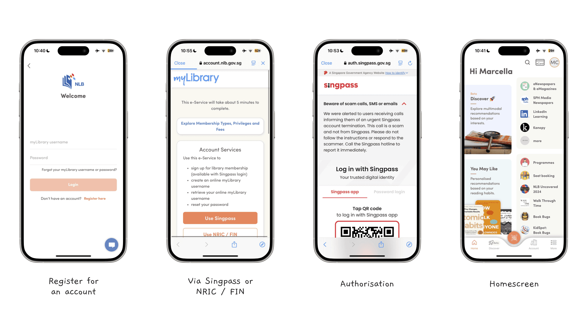
The current NLB app sign-up process involves a relatively straightforward step for users to sign up, primarily through myLibrary username/password or Singpass/NRIC/FIN verification. While this ensures security and streamlined registration, there is an opportunity to enhance the onboarding experience by gathering more user preferences upfront.
Direct Competitor
Goodreads is a widely used book discovery and reading management platform, making it a direct competitor to the National Library app in terms of book recommendations, user engagement, and personalized reading experiences. While Goodreads does not provide library services like borrowing books, its strong personalization and community-driven features offer valuable insights for improving the NLB app.

Unlike the NLB app, Goodreads gathers more user preferences during the sign-up process to improve personalization from the start. Before completing registration, Goodreads asks:
1. Favorite genres to tailor book recommendations.
2. Preferred reading format (physical books, e-books, or audiobooks).
3. Reading goals (e.g., how many books they aim to read in a year).
4. Initial book ratings to refine future recommendations.
Indirect Competitor
I am analyzing Netflix as an indirect competitor to the National Library app because both platforms serve a content consumption experience—one for books and the other for entertainment. Despite their differences in medium, they share key similarities in user behavior, such as content discovery, personalized recommendations, and retention strategies.
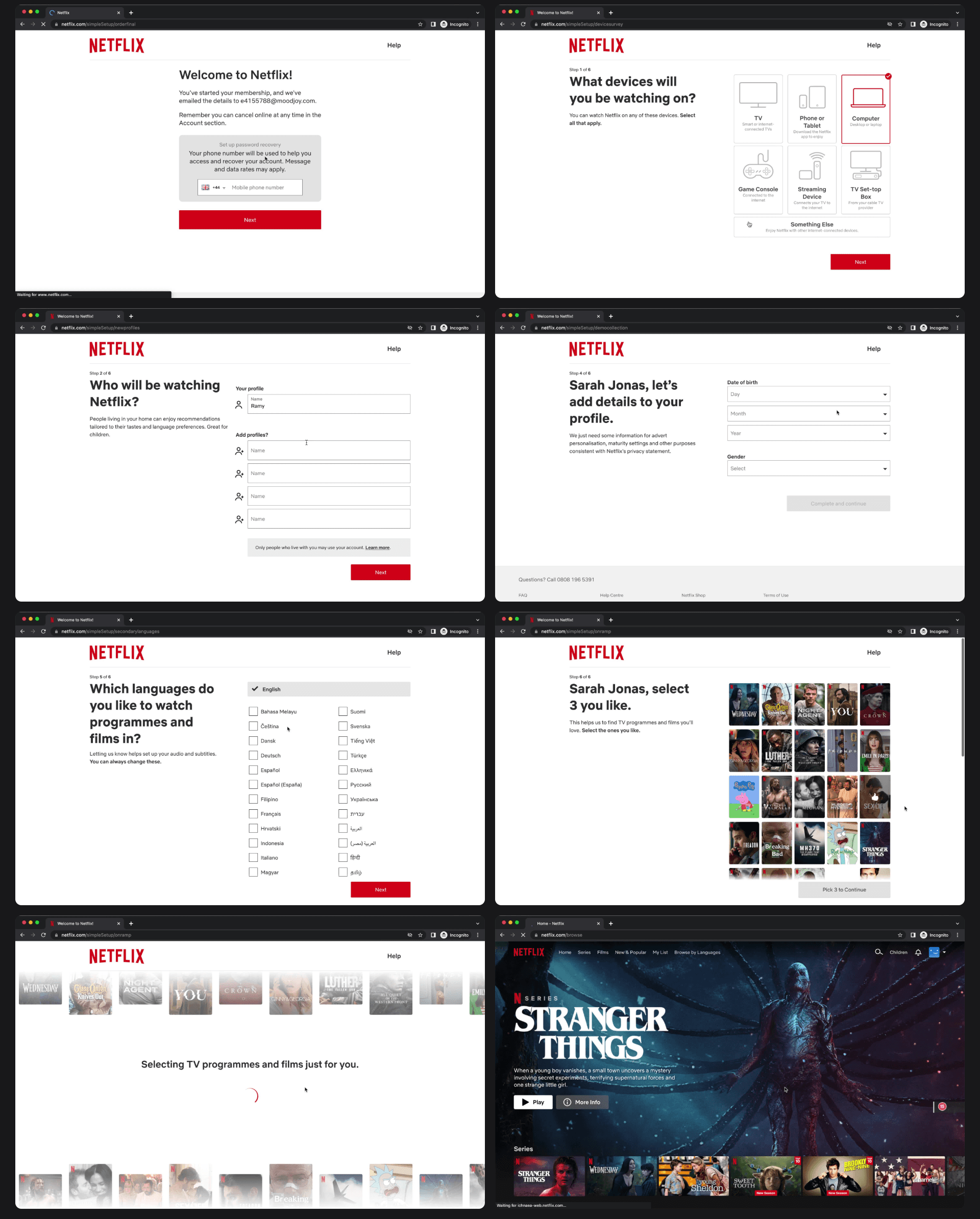
Source: pageflows.com
03 Design
Overview
Onboarding Form
Revamped Homepage
Onboarding Form
Through my analysis of the current NLB app experience, I identified key areas where personalization is lacking, particularly in content discovery and user engagement. Right now, the app primarily focuses on account registration and authentication, missing an opportunity to understand user preferences at the start.
Additionally, my competitive analysis of GoodReads and Netflix highlighted how their onboarding process gathers essential user preferences upfront—from favorite genres to past content consumption—allowing them to deliver highly personalized recommendations from day one.

To address these gaps, I decided to introduce an onboarding form for new users, allowing them to provide key information that will shape their reading experience. The form includes:
• Languages users usually read in – Helps recommend books in the right language, avoiding irrelevant suggestions.
• Preferred genres – Ensures book recommendations align with users' interests (e.g., fiction, sci-fi, self-help, etc.).
• Favorite authors – Allows the system to suggest books by similar or related authors.
• Rating favorite books – Gives insight into the types of books users enjoy the most, refining recommendations.
• Preferred reading platforms (e-books, audiobooks, physical books) – Helps tailor suggestions based on format preference.
Revamped Homepage
To bridge the gap between user preferences and book discovery, I redesigned the NLB app homepage to utilize the information gathered from the onboarding form. Instead of a generic homepage that displays the same content for all users, the new design focuses on personalized book recommendations, making the experience more engaging and user-centric.

Why I think this matters:
• Improves book discovery by surfacing highly relevant recommendations instead of overwhelming users with broad categories.
• Saves time by presenting books the user is more likely to enjoy, reducing the frustration of browsing irrelevant titles.
• Creates a more engaging user experience, encouraging users to return to the app and explore new books regularly.
By integrating data-driven personalization, the redesigned homepage transforms the NLB app into a smart digital library experience, much like how streaming platforms tailor recommendations for their users. 🚀
04 User Testing
Overview
Task 1: Fill-up Onboarding Form
Task 2: Find Library
Learnings
https://www.figma.com/proto/MDXUi6INyT3EmUZaeOszJl/Project-1---National-Library?page-id=1%3A5792&node-id=139-3034&viewport=64%2C213%2C0.09&t=Zj3uNmClfDTpSxdr-1&scaling=scale-down&content-scaling=fixed&starting-point-node-id=2%3A410Task 1: Fill-up Onboarding Form
1. 100% task susccess rate and it takes 1 minute on avergae to fill-up the onboarding form.
2. Onboarding form was “very intuitive” describing it as “similar to any other apps: interface flows nicely, buttons are clear and big enough”.

“Questions are structured and there are not many texts that needs to be read”.
Task 2: Find Library
1. On average, it takes 40 seconds to find the library where they could borrow the book from.
2. Most users start by clicking the search button.
3. Only a few paid attention or commented to the ratings.

"Visuals are clear making it very obvious what I want to see.”
Learnings
From the testing and user feedback, it’s clear that the redesigned app successfully resonates with users, particularly in making book discovery more engaging.
The personalized recommendation feature sparked strong interest, highlighting the need for an ongoing update mechanism.
Additionally, the visually rich homepage was well received, reinforcing the importance of an immersive browsing experience.
While the core solutions are ready for implementation, further refinements in features and design will ensure a polished and seamless user experience.